One of my first tasks as a designer at Projekta was to redesign the company logo and brand materials. With the focus keyword being Digital Retro, I researched the style of the 8 bit graphics scene and the isometric grid designs.

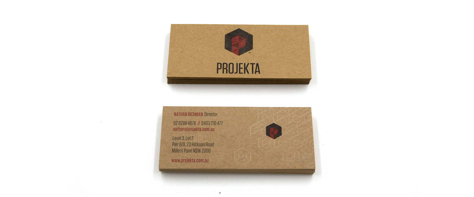
After brainstorming some initial sketches. I was drawn to the idea of the pixel and the cube. I further developed this idea of how, as an 'unfolded' cube, it could represent an abstract ‘P’ in an isometric 3D space. I balanced it, so that it could work with the wordmark and on its own as an icon. I decided it needed to be further contained in the larger hexagon, giving the overall device strength and impact.
Using the strength of the Red and Charcoal colour palette, I used shades of these colours to portray the camera aperture in abstract form. I decided on the typeface Tungsten for its characteristics of strength, impact and stability.


As the business card was our primary printed material, we decided on the organic and tactile nature of the craft board. It created a point of difference, warmth and a conversation starter for our directors.
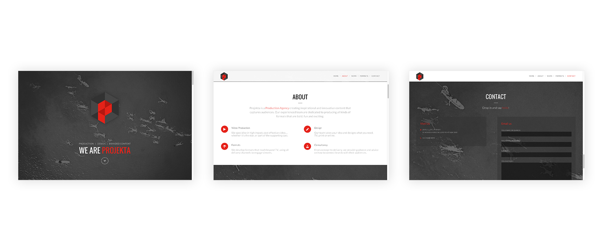
One of my responsibilities was to update the Projekta website, so that it was clean and straight to the point.
With a limited budget, I installed and customised a WordPress template, to suit our companies needs.